An exploration into walkability in the US
About the Data:
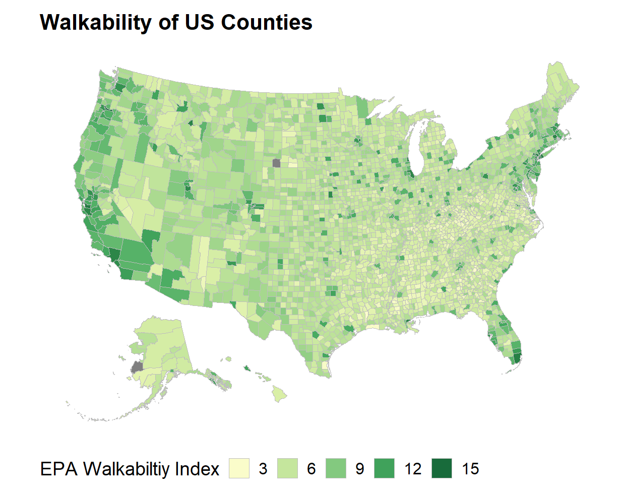
The primary dataset I used to study walkability is the EPA's smart location database. The smart location database contains numerous statistics on US infrastructure down to the block group level, including walkability index. The walkability index is a measure of how likely someone is to use walking as a form of transportation. The walkability index is generated by a composite score representing a block group’s rank in: intersection density, proximity to transit stops and diversity of land use. The general trend is that the shorter the average walk distance whether it be because of small block size, nearby public transportation or mixed land use the more likely people are to walk. Knowing this we should expect dense cities with less restrictive building zoning to have better walkability than rural areas that tend to be more spread out. Below is a graph of the walkability index in the US scaled up from the block group level to county level.

These are the expected results as counties with large cities have significantly higher walkability than their more spread out suburbs or rural counties.
Why Walkability?
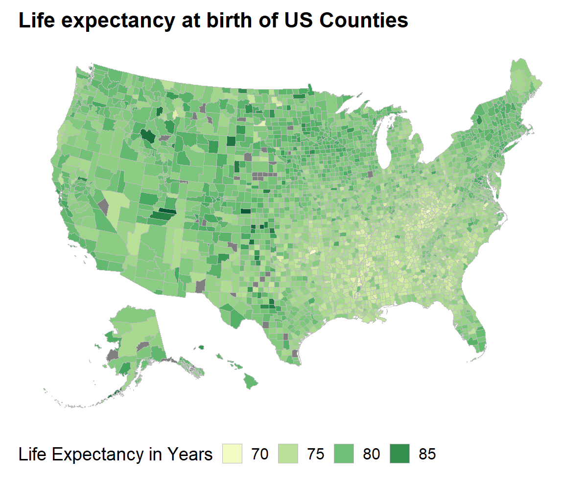
Next I wanted to answer the question: why is walkability important? I hypothesized that increased walkability would provide health benefits to people living in the area so I pulled life expectancy at birth data from the CDC's 2010-2015 study.

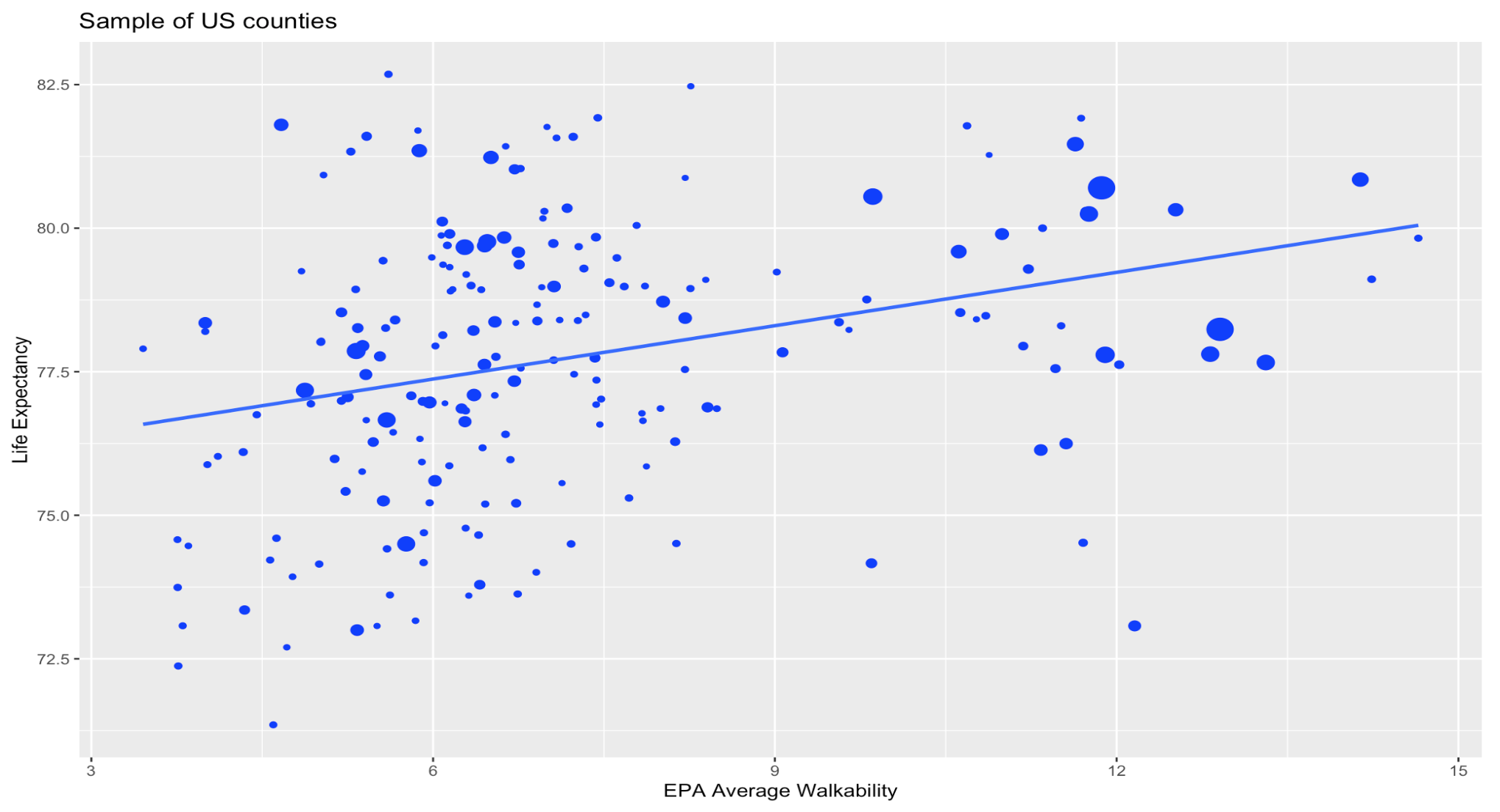
It isn't immediately apparent if there is a trend in the data when comparing the two maps because no significant outliers overlap. To see if there is a trend in the data we can calculate the correlation between the two. Using the pearson correlation method we find a correlation of 0.28 which represents a weak positive correlation. We expect this result as life expectancy has many socioeconomic factors that may contribute and walkability may only provide a small benefit when compared to something like economic status. Here is a plot showing the weak correlation in a sample of 200 US counties.

The size of the dots on the graph represent the population of the counties respectively. It is clear that counties with low populations experience much more variance in life expectancy and walkability. I expect this to be a result of lower sample size as the larger counties tend to follow the trendline more accurately. Knowing this I recalculated the correlation using the population to weight the entries. The result of this shows a correlation of .40 which shows a stronger correlation between the two factors when population is accounted for.